Supply Schedules: a table that shows the quantities supplied at different prices in a market
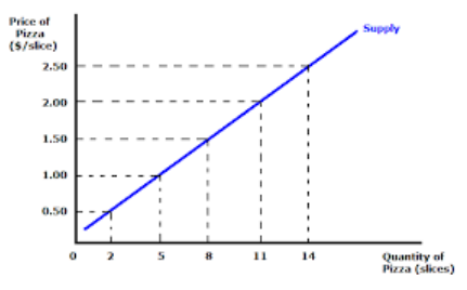 Supply Schedule Graph
Supply schedules show us how much is being produced at a certain cost. The relationship between price and quantity is a direct relationship, which means that if one factor increases, so does the other one. In this specific example they are comparing pizza slice price and quantity. When the cost is only 50 cents, suppliers are only willing to sell 2 slices of because they are making little money. When the price was raised to 2.50 per slice, they were willing to sell 14 slices because they would be making more money.
Demand schedules:a list of the quantities of a good that one persona will buy at various times
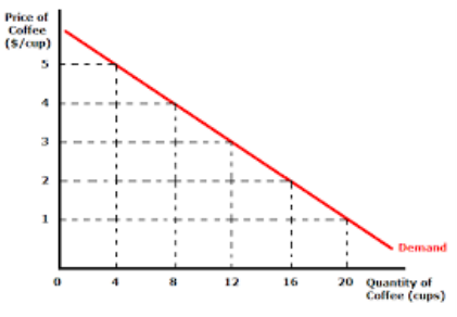
Demand Schedule Graph
Demand schedules show us how much consumers buy when products are at certain cost. This graph shows us the relationship between the cost of the product and the quantity demanded by people. Unlike like the supply schedule graph, these two variables are inversely related, which means that if one variable increase, the other one decreases. In this insistence, as the price of a coffee cup decreases, the quantity in which it is demanded, increases.
Understanding these graphs can help us better understand economy as a whole. By knowing one of the two variables on a supply or demand schedule graph, we are able to predict the other. Studying these graphs give us a good idea of how well our economy is doing and what might happen next.
